
Michigan-based X-Rite Pantone introduces colour assessment profile to help consumer brands ensure accurate colour across packaging types in the design phase.
‘Colour consistency is critical in brand recognition because consumers often associate any colour discrepancy with product quality,’ said Cindy Cooperman, vice president, brand global strategic accounts, X-Rite Pantone.
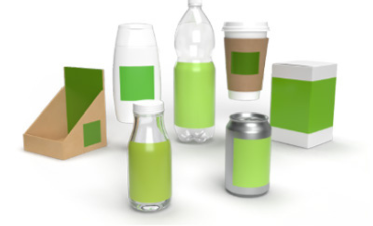
When printing, brands can use either a spot colour or a CMYK breakdown. While spot colours are more accurate, CMYK is more economical. The choice of packaging material, printing process, ink, and packaging types (stand-up pouches, folding cartons, labels, overwraps) can significantly influence the final appearance of a brand’s colour on the shelf.
Ms Cooperman on the irregularity of colour consistency across the packaging of products, stated, ‘Our brand colour assessment profile aims to alleviate this by helping brands understand how colour will reproduce early in the design process before colour samples are even sent.’
X-Rite Pantone assessment profile means brand managers and designers can see how specific brand colours will look on multiple packaging substrates, whether CMYK is accurate enough, make informed colour decisions early in the design phase which will reduce time spent trying to hit unachievable colours.
Ms Cooperman concluded, ‘By leveraging X-Rite’s colour libraries and digital tools, brands can gain peace of mind in their colour decisions.
‘Our goal is to empower brands with the necessary colour data and insights to make informed colour choices and reduce time spent on colour adjustments, ultimately enhancing brand visibility and consumer engagement.’