
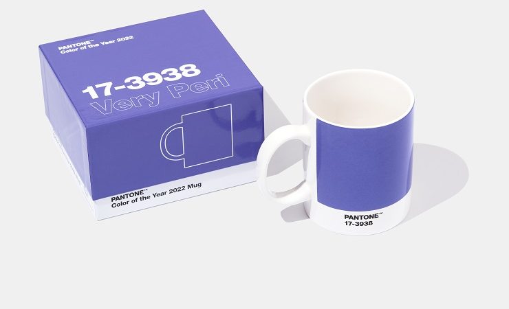
Global colour authority Pantone has introduced a new blue shade, 17-3938 Very Peri, which has been selected as Pantone Color of the Year 2022.
Pantone 17-3938 Very Peri is identified as a ‘dynamic periwinkle blue hue with a vivifying violet-red undertone’, and is said to ‘blend the faithfulness and constancy of blue with the energy and excitement of red’.
‘This happiest and warmest of all the blue hues introduces an empowering mix of newness,’ declared Pantone.
Leatrice Eiseman, executive director, Pantone Color Institute, commented, ‘As we move into a world of unprecedented change, the selection of Pantone 17-3938 Very Peri brings a novel perspective and vision of the trusted and beloved blue colour family. Encompassing the qualities of the blues, yet at the same time possessing a violet-red undertone, Pantone 17-3938 Very Peri displays a spritely, joyous attitude and dynamic presence that encourages courageous creativity and imaginative expression.’
Whilst the colour is applicable for multiple applications and end uses, in terms of packaging Pantone 17-3938 Very Peri is said to, ‘fuse together the undertones of the constancy and continuity of blue with the energy and excitement of red.
‘Pantone 17-3938 Very Peri conveys a message of credibility as well as creativity. Whether appearing in a fantasy digital realm or in physical materials, Pantone 17-3938 Very Peri exudes a good-natured warmth that quickly engages the eye, making it an ideal shade for many applications of graphic and multimedia design as well as packaging.’
Laurie Pressman, vice president, Pantone Color Institute, added, ‘The Pantone Color of the Year reflects what is taking place in our global culture, expressing what people are looking for that colour can hope to answer.’
Pantone 17-3938 Very Peri is described as ‘displaying a carefree confidence and a daring curiosity’, which, ‘helps us to embrace this altered landscape of possibilities, opening us up to a new vision as we rewrite our lives. Rekindling gratitude for some of the qualities that blue represents complemented by a new perspective that resonates today, Pantone 17-3938 Very Peri places the future ahead in a new light.’
Ms Pressman continued, ‘Creating a new colour for the first time in the history of our Pantone Color of the Year educational colour programme reflects the global innovation and transformation taking place. As society continues to recognise colour as a critical form of communication and as a way to express and affect ideas and emotions and engage and connect, the complexity of this new red-violet-infused blue hue highlights the expansive possibilities that lie before us.’
The Pantone Color of the Year selection process sees the Pantone Color Institute comb the world looking for new colour influences from a variety of sources. Since the turn of the century, the following colours have been named Pantone Color of the Year: Cerulean, Fuchsia Rose, True Red, Aqua Sky, Tigerlily, Blue Turquoise, Sand Dollar, Chili Pepper, Blue Iris, Mimosa, Turquoise, Honeysuckle, Tangerine Tango, Emerald, Radiant Orchid, Marsala, Serenity and Rose Quartz, Greenery, Ultra Violet, Living Coral, Classic Blue, Ultimate Gray and Illuminating, and now Very Peri.