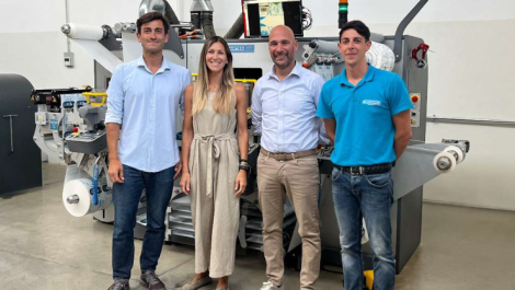
Finat, the renowned European self-adhesive label printing industry association, has revealed the winners in its 2021 Label Competition, where digital featured heavily.
The competition is organised annually by Finat to honour and highlights the advantages and uses of self-adhesive labels and flexible packaging as an effective marketing, promotional or identification tool. This has seen an increasing presence of digital alongside flexo and offset. In fact, as noted by judging chairman Tony White, across this year’s competition 83 entries were printed solely using digital technology. Specifically, he said, ‘The steady march of digital printing was noticed in the Marketing Group, with 88 of the 108 entries involving digital in one form or another.’
In total, across five groups, 23 winning entries were selected, with a further 80 highly commended. A total of 222 entries were received in the Finat Label Competition 2021.
One of those groups, E, is the digital category, where MCC Label Paarl (South Africa) was honoured for its ‘Cape Fynbos Gin’ entry. Printed in four colours using toner digital printing technology, the judges noted MCC’s winning entry as, ‘An extremely well printed label which, at first sight appears to be a set of stamps but in fact the perforations are created using a gloss tactile varnish. The content of the label depicts a biome of plants found in South Africa and are characterised by a diverse richness of endemic plant species. Each plant is named for identification.’ A high gloss spot varnish was used on the plants and the main title.
In the Marketing/End-Uses group, as previously identified by Mr White, the role of digital in the category is borne out in numerous winning entries. This includes:
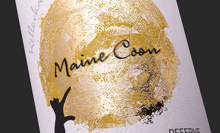
- Marzek Etiketten+Packaging (Austria) for ‘Kellerkatze Maine Coon’, a wine label digitally printed in five colours and complemented by hot foiling to depict a black cat staring at a full golden moon. According to the judges, ‘The contrast between the two main components of the label gives a visually effective appearance.’
- Marzek Etiketten+Packaging (Austria) for ‘Stiegl Hausbier Nr. 37’, a digitally printed beer label using a matte varnish, and which features a, ‘colourful mid-section that tells the story of the manufacture of the beer and balances the two information panels very well.’
- Skanem Skurup (Sweden) for ‘Farsta I Love You 5.8%’, an inkjet printed beer label using a gloss varnish to enhance the quality and appearance of the end result, according to the judges.
- Marzek Etiketten+Packaging (Austria) for ‘Bio Hanföl’, a label for organic hemp oil that was printed digitally in four colours and a dominant green colour in different shades cited for adding ‘interest and reenforcing the product’s bio pedigree’. A gloss finish was achieved by lamination to protect the label in use.
- Stratus Martin (France) for ‘Candela Jasmin d’Orient’, a fragrance label printed digitally in four colours on a pink, rose coloured substrate, finessed with gold foiling and debossing to add ‘even more quality to the end result’. Symmetrical shapes within the label each containing a subtle colour and blind debossing creates a high degree of interest.
- Stratus Martin (France) for ‘Nayomi – Silver Pearl Hair Mist’, a label printed digitally in 12 colours plus silver foiling. The front of the label has the product and suppliers’ names encapsulated in a silver circle to draw the eye to that information. The information panel is backed by a dominantly purple swirling design, ‘which is an ideal backdrop for the extremely sharp type and Arabic lettering.’
- Dars 91 (Bulgaria) for ‘Love Tuition by Dars’, a self-promotional label that was digitally printed in four colours in five passes through the converting process. The design features a main heart layer that when peeled back exposes a simple message and releases a pleasant scent. This demonstrates a novel way for Dars to show a potential customer its capabilities.
- Reynders Label Printing (Belgium) for ‘Dada Chapel’, a set of labels digitally printed in seven colours that are used to introduce unusual alcoholic drinks with a touch of humour. The company logos are printed in black on the reverse side so that they are visible through the clear liquid in the bottles. Embossing, hot foiling and a tactile varnish add value and interest to the finished labels.
The ‘Best in Show’ award went to Austria’s Etiketten Carini for the ‘Priorat Sobre Todo’ wine label entry. This used AM screening and six-colour offset lithographic printing to create an appearance comparable to copper plate engraving. A transparent foil gives the label added interest, especially when viewed from an angle. The use of copper foil and debossing, ‘bestows a quality look to the final result,’ noted the judges.
Speaking overall about this year’s entries, Mr White said, ‘This year, I noticed that more labels than usual were exhibiting a touch of humour in their design, mainly in the drinks and cosmetic categories. Maybe this is an unconscious reaction to the pandemic?’