
Short runs with variable printing made this job a prime candidate for digital printing
When artisan craft distillers, Warner Edwards, wanted a standout label for its Harrington Dry Gin, the company turned to design agency bluemarlin and self-adhesive label printer, Label Apeel. This cooperation resulted in a digitally printed label that truly represents the values behind this vibrant young brand and reflects the high quality of the product. By Neel Madsen.
Handcrafted by friends Tom Warner and Sion Edwards in a Northamptonshire barn, Harrington Dry Gin is a true labour of love with just 700 bottles produced in each batch. They first met at agricultural college in 1997, and in 2010 decided to pursue their dream of setting up a business together. After initially settling on growing lavender and other herbs, the pair came upon the idea of making gin instead of producing aromatic oil in their newly bought still, which they had set up in a converted old barn on Tom’s family farm, in Harrington, Northamptonshire.
After three years of hard work developing the product itself, the pair came to the other vital part, namely the packaging, and for that, they engaged the services of bluemarlin and Label Apeel. ‘People decide whether they like your brand or not with 90 seconds,’ said Sion Edwards. ‘For this reason, we decided that an investment in packaging was a key area.’
Tom Warner said, ‘We are both over the moon with the product we have ended up with. We needed a brand that portrayed quality and the artisan nature of our business. This label gives us some heritage as a new business. It is all about nostalgia and heritage at the moment, and we needed a label that told our story, and we needed to partner that fantastic piece of branding with a manufacturer that could deliver the quality we needed in terms of all the intricacies, like debossing and foiling.’
United in spirit
Earlier this year, the brand won Best New Launch Design at the World Gin Awards, and just recently achieved double gold medal at the San Francisco World Spirits Competition 2014, so there is plenty to celebrate for design agency bluemarlin which worked on the project.
Simon Pendry, creative director, explained the reasoning behind the design, ‘With Warner Edwards, it was really important to bring in the two founders and their two histories – one is English and one is Welsh – we really wanted to bring to life their partnership on the packaging. This is symbolised by the Welsh dragon and the English lion saying cheers with the Martini glass, and also within the weathervane with the W and the E representing not only their names, but of course also West and East, and Wales and England.’
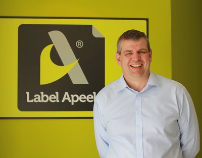
Stuart Kellock and his team worked closely with both brand owner and design agency to produce an exceptional label
And so to print
Mr Warner explained the choice of printer, ‘Obviously the geographical location played a part as Label Apeel is relatively close to our distillery, but mainly they brought a lot of expertise, options and flexibility to the table, and we felt comfortable that they could deliver the product that we wanted.
Mr Pendry said, ‘The relationship with Label Apeel was great because we were able to suggest stocks, embossing and foils to them and then they would come back with suggestions and work with us on that to create the best effect.’
This is not the first time that Label Apeel has used its expertise to print exceptional labels for high end gin bottles. Another client is artisan brewer, Southwestern Distillery, while the Gilpin’s Extra Dry Gin label produced for Westmorland Spirits a couple of years ago, secured Kellock and his team a win at the UK Packaging Awards in 2012.
Stuart Kellock, managing director, said, ‘It is paramount that the company chosen to do the printing has the capability to produce the quality the customer is looking for. We have a good reputation in the spirits sector already and work with a number of high end clients. This cooperation worked really well, but not all jobs are as straightforward as that. You do find that some customers are spending a lot of money on designers but may not be as effective in their choice of printers.’
Digital delivers
The label was printed on a white, uncoated, matt woodfree printing paper with a ‘hammered’ tactile embossed finish from Fasson, on an HP Indigo WS6000 press. The tamper seal labels were sequentially numbered with bottle and batch numbers, and the neck of the bottle finished with a copper wire reflecting the copper foil on the label itself.
‘The label is a relative straightforward construct,’ said Mr Kellock. ‘The first crucial element was getting the material right, making sure we chose something which was going to have the right level of impact in terms of quality. This is a very high quality brand and we needed that to be reflected in the paper.’
The second part was choosing the right print process, and with short run lengths, the job had the right requirement for digital. Mr Kellock said, ‘A lot of people are still very nervous about the consistency of digital print, but we never have any problems. Using our HP Indigo WS6000, we were able to get the right colour and produce it consistently and ongoing, so there were no major issues in terms of print quality and colour matching. In fact, I have yet to find a colour I can’t achieve on our digital press.’
He continued, ‘Digital played a big part in being able to produce the label cost effectively. It is not a design that you couldn’t do conventionally, but for the volumes we are talking about here, that is where digital steps in and is able to deliver real impact on the shelf without the start up company having to shell out a huge amount of cash.’
Mr Pendry said, ‘It was really interesting that we were able to get the batch number across the label on the top, so each edition of the bottle has a different number, and that’s what we find with digital printing that this was possible and it was possible very easily. If we weren’t printing digitally we wouldn’t have been able to get that effect and make it so personalised.’
Tom Warner agreed, ‘Most of the stuff I’d done previously doing contract packing for supermarkets was litho producing hundreds of thousands or even millions of units. Digital brought us the flexibility to do very short runs of a very high quality and all the flexibility to do what we wanted so it made 100% sense.’
Keeping a cool head
To achieve the high quality look and feel of the label, a striking copper foil was added against the deep blue standing in contrast to the matt finish of the rest of the label, while a de-boss reinforced the tactile finish. It is a sophisticated high quality look aimed perfectly at the target market and complementing the handcrafted nature of the product.
When it comes to secondary decoration processes, there is however a risk of adding effects for effects’ sake, according to Mr Kellock. ‘The decorative side is very often considered to be the most creative part of the design process, but for me, it is the area where the most cool-headed approach is required. It is too easy to let the ‘pretties’ and the ‘shinies’ run away with you. It actually comes down to good old-fashioned hard business, what is it going to return? Clients should ask themselves, if I am going to put a foil on this design what is it going to cost and how much more product am I going to sell because of it?
‘Of course a label has got to look attractive, but a good designer is able to create a design without any additional decoration. The decoration must be able to hold its own as an investment and must be done extraordinarily well. It should either allow you to charge more for the end product or increase the number of units sold, or in a perfect world both.’
The company runs a Digicon 2 finishing line from AB Graphics, which offers flat bed screen printing, hot and cold foiling, embossing, flexo and lamination.
Communication is key
This project is a wonderful example of designer and printer working together in the best interest of the client, but just how easy it is to get a meaningful dialogue going between the parties? The label printer is the expert when it comes to choosing the material, the print process and the decoration, and can guide the designer and advise on the endless possibilities and opportunities.
Mr Kellock said, ‘It tends to be the customer approaching us, and actually getting the conversation going with the designers is difficult. Obviously they are working on very hard briefs, not every job they’re picking up is a self-adhesive label, so they don’t necessarily want to talk to a label printer every day of the week. To build that relationship you’ve got to be in the right place at the right time, with the right knowledge and talking the right language as well. Designers are very specific in the way they talk and we have found that speaking their language means that we have more of an impact.
‘Our job is making sure that what the designer wants is do-able, translating the ideas into physical engineered print. We bring a lot of knowledge in terms of getting the very best out of the design, making sure the colours have got the right level of impact and the right level of contrast; that the foils are the strongest and most vivid you can get and that you get the highest level of accuracy in terms of print registration. I think that is our job – the interpretation of the print.’
And for the designer being able to utilise the expertise of the printer is equally useful. Neil Turnbull, bluemarlin production manager,said, ‘Having a dialogue with the printer is very important. It is great when they come back, as Label Apeel did, with suggestions for the right stocks and the right foils. It gives both the client and us a better idea of what we can put on shelf as a finished product. This project has also made me more aware of what can be achieved with digital printing and I am keen to learn more about the opportunities.’
Watch the video here: